Clariant presents new automotive edition of ColorForward 2018
This is the second year Clariant has formatted its colour/trend analysis tool to meet the needs of automotive designers.

17th March 2016
Innovation in Textiles
|
Muttenz
Clariant, a leader in specialty chemicals, has released the Automotive Edition of ColorForward 2017. This is the second year Clariant has formatted its colour/trend analysis tool to meet the needs and interests of automotive designers and marketers.
Clariant’s ColorForward trend-analysis and colour-design tool has been released every year since 2006 to help plastic product designers and marketing professionals make more informed colour choices.
It presents four global societal trends that can be expected to influence consumers and then links them to colours that evoke an emotional response related to each trend.
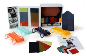
The Automotive Edition is the work of the Clariant Masterbatches European Automotive Team in collaboration with the colour specialists at the Clariant ColorWorks design and technology centres. It presents 20 colours, linked to the four trends, in several different forms:
These samples are packaged in a presentation box and are meant to be handled, rearranged and studied as part of a creative exercise.
“We are not trying to teach our automotive customers about colour,” explained Laura Carrillo, Head of Market Segment Automotive, Clariant Masterbatches Europe. “They are already experts. We want to start a dialogue with them about global societal trends and, at the same time show them these different materials so they become more aware of possible colour harmony issues. In any case it should be fun and inspirational.”
An anagram of the phrase “my information” is intended to capture the ambiguous, yin/yang nature of the information universe. Data mining, or the systematic sifting of digital information to achieve a specific purpose, is central to this trend theme. The duality of the web-world is captured in the annoy firm omit trend colours. Two of the five are dark and sinister.
In a connected world, the last taboo is being lonely. “Delonelination is a wake-up call,” said Judith van Vliet. “It is a warning that loneliness is on the rise, particularly among young people. The five colours representing this trend are generally pale and muted, ranging from a beige to suggest the human need to be handled with care, to a plain brown.
This theme can almost be seen as the antithesis of loneliness because it recognizes a trend toward complex connected relationships. Colours representing this theme include a light green/yellow like the inside of a cucumber, and a diffuse red. There is a lilac purple and a brownish orange, almost cognac-coloured shade.
“Life can be a trap,” said van Vliet. “It can be hard and stressful – or just plain dull – if you allow it to become that way, and so people are beginning to seek new ways to break out, to be curious and explore the limits of the human mind. This trend is about escapism and finding new modes of perception.” The colours of this trend theme tend toward a funky new aesthetic.
Business intelligence for the fibre, textiles and apparel industries: technologies, innovations, markets, investments, trade policy, sourcing, strategy...
Find out more